
ABRI Consulting
Construction Consultancy
🇺🇸 UNITED STATES
About
ABRI Consulting was founded to transform the complex world of permitting, compliance, and land development into a simpler, faster, and more human experience.
Built on deep regulatory expertise, strong relationships, and a commitment to community impact, ABRI empowers civil engineering firms, contractors, and infrastructure developers to move meaningful projects forward without the bureaucratic stress.
Services
Brand Identity
Logo and Visual Identity
The Challenge
The permitting and compliance industry is traditionally seen as technical, cold, and bureaucratic — a perception that made it hard for ABRI’s human-centered approach to stand out.
We needed to create a brand that reflected ABRI’s unique value: transforming regulatory complexity into a smooth, collaborative, and empowering experience, while maintaining credibility and authority in a highly technical field.
Our Approach
We developed a brand strategy that balances emotional connection with technical expertise, positioning ABRI as both a trusted guide (The Caregiver) and a visionary problem-solver (The Magician).
From the brand’s voice to its messaging pillars, every element was crafted to feel warm, clear, and empowering — simplifying a complex process and making clients feel supported at every step.
Archetypes
The Caregiver as the primary archetype emphasizes support, protection, and empathy. This choice reflects ABRI’s mission to simplify complex permitting processes and provide clients with a reassuring, stress-free experience. The Caregiver approach to communication and service builds trust, emotional connection, and a true sense of partnership.
The Magician as the secondary archetype complements the Caregiver by bringing strategic insight, transformation, and innovation. This choice reflects ABRI’s commitment to turning regulatory complexity into clear, actionable paths forward. The Magician brings a visionary and solution-driven energy to the brand, making the impossible feel seamless and achievable.
Logo Concept
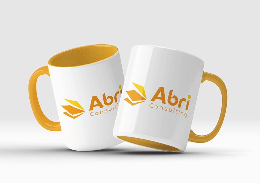
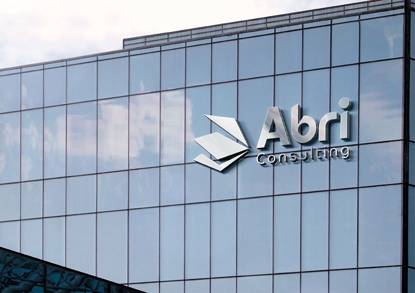
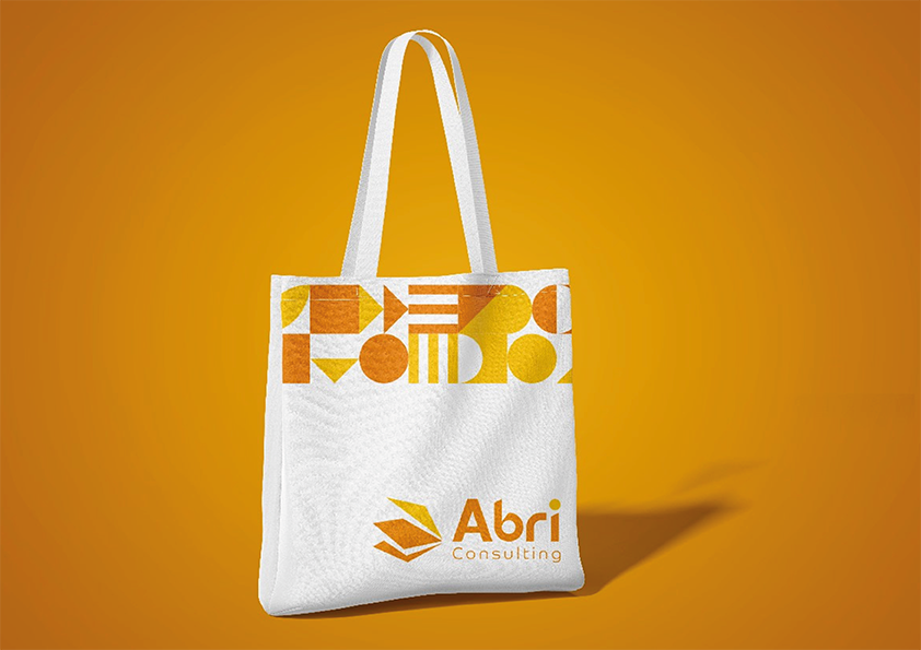
ABRI logo was designed to reflect the brand’s essence: turning complexity into progress. Three overlapping shapes resembling documents form an upward-pointing arrow, symbolizing growth, evolution, and streamlined movement through bureaucracy. The vibrant color palette — deep orange for energy and innovation, bright yellow for clarity and optimism — reinforces the brand’s commitment to making complex processes simpler and more human. Rounded typography adds a sense of warmth and trust, highlighting ABRI’s role as a reliable, supportive partner in the land development journey.
Results
Today, ABRI Consulting has a cohesive brand identity that clearly reflects its expertise, human-centered approach, and commitment to simplifying complex permitting and development processes. With a strong strategic foundation, the brand now communicates with greater clarity, consistency, and impact across all touchpoints.