
Jeff Jenkins
Travel & Media
🇺🇸 UNITED STATES
About
Jeff Jenkins is an award-winning travel blogger, speaker, podcast host, and documentarian based in Austin, Texas. What started as a blog called Chubby Diaries — created in 2017 to fill a gap in representation for plus-size travelers — grew into a movement, a community, and most recently, a National Geographic-backed TV series. Featured in Forbes, The New York Times, and Travel + Leisure, Jeff is proving that adventure belongs to every body.

Services
Brand Strategy
Logo and Visual Identity
The Challenge
- Jeff’s brand had outgrown the “Chubby Diaries” identity — he was now a documentarian, speaker, and multi-platform creator, but the brand wasn’t reflecting that growth.
- No clear visual system existed to unify Jeff Jenkins across TV, social media, speaking engagements, and merch.
- The brand needed to feel inclusive and joyful without becoming niche — it had to speak to Jeff’s community and also appeal to major partners, sponsors, and media.
- Multiple revenue streams lacked a coherent architecture.
Our Approach
- Anchored the brand in two archetypes — The Explorer and The Everyman — creating a framework that balances aspiration with radical relatability.
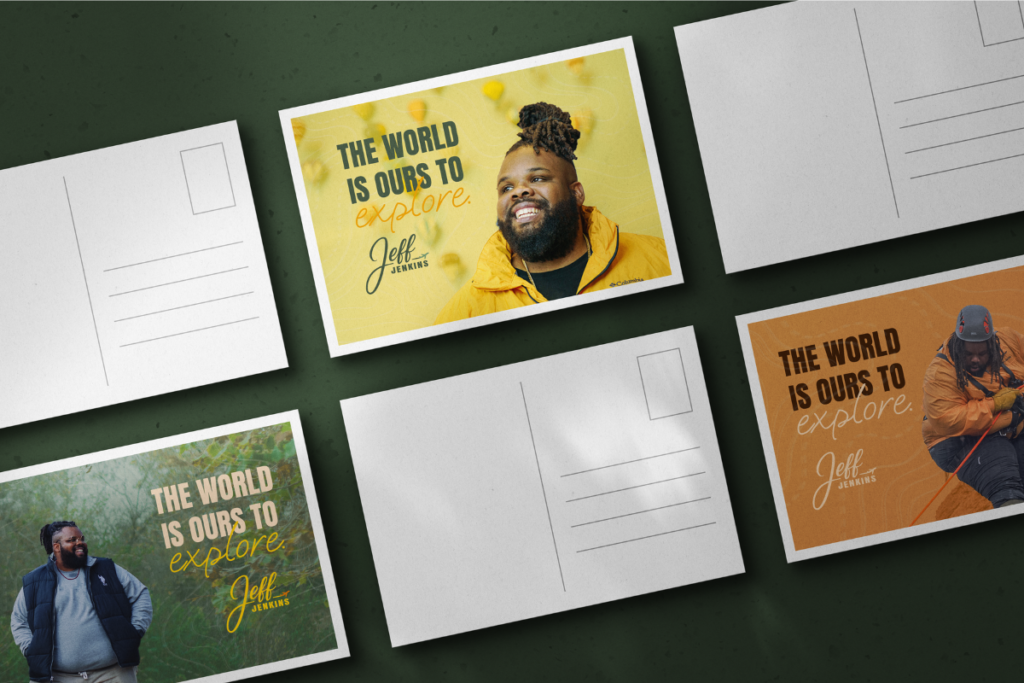
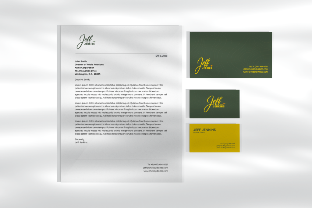
- Built a visual identity rooted in Jeff’s world: topographic patterns, a warm earthy palette (deep greens, golden yellow, burnt orange), and a handwritten-meets-bold logo system.
- Defined a brand architecture that lets sub-brands like Chubby Diaries and the NatGeo show coexist under one clear master brand: Jeff Jenkins.
- Created a full voice guide so Jeff’s tone of warmth, joy, and community ownership can scale across every platform and collaborator.
Archetypes
The Explorer (aspiration, adventure, freedom) meets The Everyman (relatability, inclusivity, belonging). Together, they position Jeff as the joyful guide, not a distant celebrity. Someone who explores the world with courage and authenticity while making sure everyone feels welcome to come along
Logo Concept
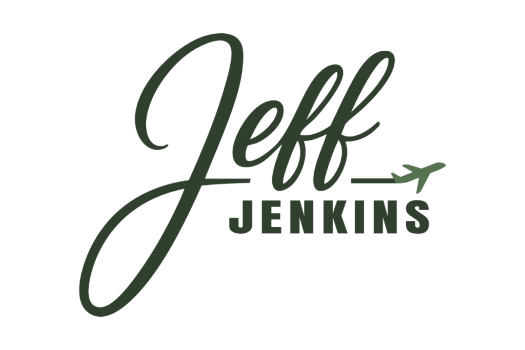
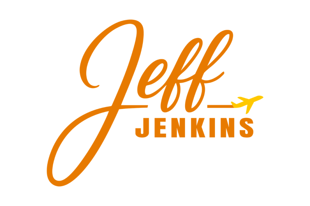
The logo reflects Jeff’s identity as a joyful, authentic explorer. The handwritten “Jeff” conveys warmth and approachability, while the airplane symbolizes freedom, movement, and discovery. The bold sans-serif “Jenkins” adds professionalism and balance. Together, these elements express Jeff’s essence as a relatable yet inspiring guide who makes exploration inclusive for all.
Colors
6-color system rooted in nature, exploration, and warmth — built for screen and print.
Typography
The quick brown fox jumps over the lazy dog
Anton Regular
The quick brown fox jumps over the lazy dog
Oooh Baby
The quick brown fox jumps over the lazy dog
Quicksand
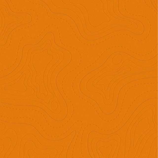
Patterns & Backgrounds
Topographic lines reflecting exploration, movement, and terrain — used across all backgrounds.


Results
Through this project, Jeff Jenkins went from a niche blog identity to a full-scale personal brand — complete with strategy, visual identity, and brand architecture across four revenue streams. Audience personas were mapped to sharpen messaging for partnerships and media, and brand guidelines were built to scale consistently across every platform, format, and collaborator.